Title Sequence #19
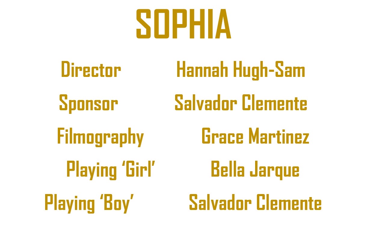

We settled on this font which was Britannica Bold. The font had a very minimalistic but is still bold enough to jump out at you. The color was very bright to match the ambiance went for. We made it in all caps so it would very uniform and bold. The title "Sophia is named after the main character in the film. Hanna directed it, Salvador provided equipment, I filmed, and Bella & Salvador acted. Their names are the girl and the boy because our film has no dialogue so they are not named in the film.
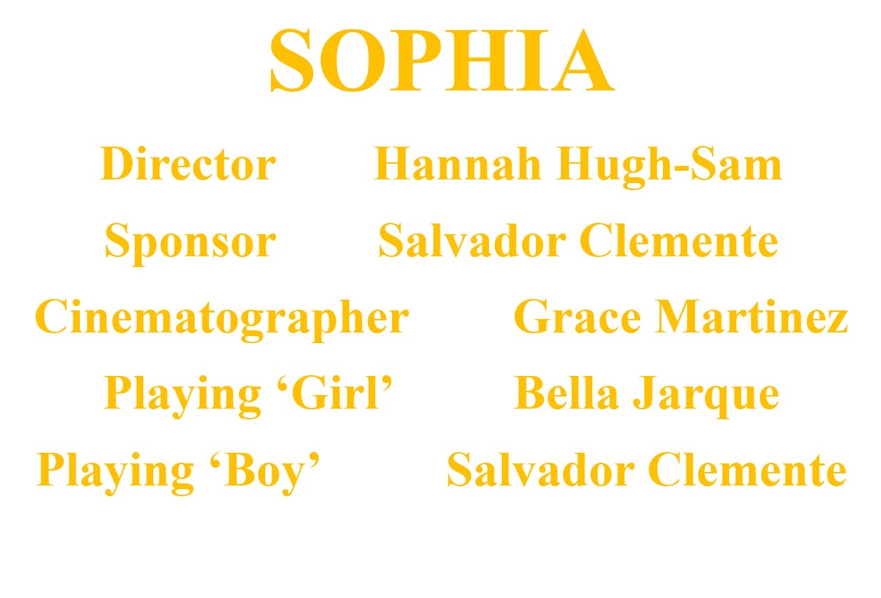
We almost picked this one, Times New Roman in a much lighter color. We liked the color of this one a lot more than the others, however, we felt it didn't feel very right. The font is also quite basic so it made the title seem cheap and boring.

Comments
Post a Comment